
10 SEO Stats That Will Make You Look Smart Around the Water Cooler
This is a post from contributing author Victoria Greene - Brand Marketing Consultant & Freelance Writer.

If you're new to HubSpot, we guide you on where to start, how to do it right, and train you to make the most of the platform.
Review your HubSpot portal to uncover issues, spot growth opportunities, and ensure you're maximising its potential.
Unlock business growth with automation and attribution. Implement best practices and execute marketing campaigns.
4 min read
Google and pretty much every other web professional in the world has been putting out the same message for a good few years now – get your site mobile ready if you want to make it a winner. Now the search giant has gone one step further and announced a major algorithm update specifically focused on mobile starting from April 21st.
From this data, sites will be ranked depending on how mobile friendly they are and from today, apps will also become more prominent in search results. According to Search Engine Watch, quoting a recent Q&A session with Webmaster trends analyst Gary Ilyes, details of the mobile friendly algorithm include:
Google has confirmed that mobile friendly sites will be placed higher in the SERPs once the new algorithms kick in; it will affect all sites globally too.
It means that if you’re not yet mobile ready, then you should get working on it immediately if you don’t want to see your site fall down the rankings. There are a few options that you can take to do this, although if you have a legacy site that’s years old you may need to (and be better off) start from scratch.
Mobile friendly sites tend to fall into three categories:
When considering a new web project, many businesses first have to choose if they’re going to build a standalone, dedicated mobile site or if they are going to go down the route of an ‘all-in-one’ RWD or adaptive site. To some extent this will depend on a number of factors such as available budget, the type of site and the development team you might have on hand.
The difference between the different types of site suitable for mobile include:
As I said earlier, your decision when it comes to which type of site to have depends on your budget and ongoing resources. For most businesses, the best choice is going to be RWD but this isn’t the Holy Grail of design and if not done well, RWD can come with its own problems. One of the most common that was seen when RWD first took off was in site speed. Site designers were not crafting RWD sites so that mobile content only was delivered to the target device, rather many were being created that delivered the full desktop experience to every device, regardless of size.
Whilst the user might not see all of the content, the fact that it was loading anyway made for a lot of slow sites. This is not as much the case anymore, there are plenty of techniques that a developer can employ to ensure that this doesn’t happen. However, it does mean that you should choose your development team wisely and ask to see live examples of previous RWD sites that they have worked on. You should also do this for dedicated mobile and adaptive, but it’s more important for RWD – speed does affect the UX, SEO and the bottom line.
It’s also worth considering that adaptive design is considered by some to be slower than responsive (when the latter is done well) as it has to load all of the various layouts.
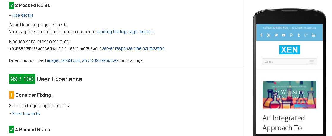
To check if your site is already suitable for mobile, carry out a Google Mobile-Friendly test and this will score your site.

You will get this message if your site is OK, along with any suggestions for making your site even better for mobile. If you carry out a test on the Google Page Speed site then you will also get a score out of 100 for the site overall, for mobile, site speed and for UX along with suggestions about changes you need to make.
The most common error that’s seen on page tests like this is to do with images. In order to get yours mobile-ready, make sure that they are optimised before you upload to save time and expense later on. You should also stay away from Flash as this is fast becoming obsolete, is incompatible with iOS (without lots of hassle for the end user, anyway) and isn’t crawled by the search engines. Instead, ask your developer to use modern coding and techniques such as HTML5 which allows you to draw directly into the browser to create animations and suchlike.
Technology moves so quickly that it’s almost impossible to future-proof any site. Just a few short years ago the idea that we would be accessing the web on mobile devices so often and so effectively would have seemed novel to many. For the most part, site owners have caught up and made sure that their sites are ready for mobile and tablets, but there are still plenty of sites out there that haven’t.
With smartwatches, the Internet of Things (IoT) and wearables entering the market and showing healthy growth already, it’s likely that the way we access the net will continue to evolve at its current pace. It’s impossible to optimise web pages for these things for the majority of sites right now, but it’s worth thinking about when planning budgets – if you spend 1000s or even 10s of 1000s getting your site rebuilt complete with excess bells and whistles, you may regret it in five years’ time when it’s time to look at optimising for another format.
There’s no getting away from it anymore when it comes to mobile though, it’s necessary for every business with a web presence to ensure that they have a mobile-friendly site if they want to remain competitive.